Farewell Inbox, You'll be Missed
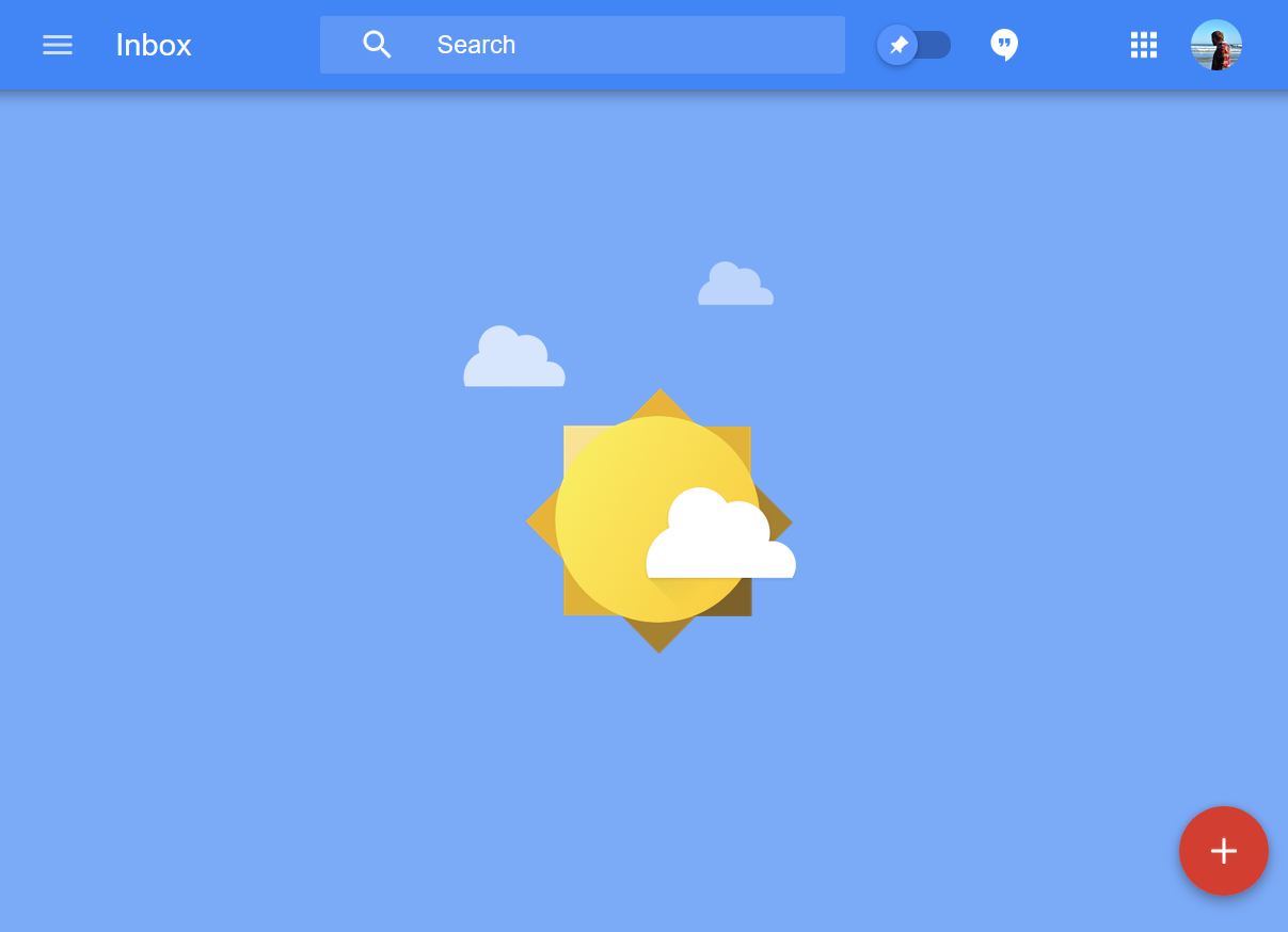
Tomorrow marks the end for Google’s lesser known but incredible email application Inbox, so I wanted to put down my thoughts on why this was such a great piece of software and will be missed.
Email is Great
Since the early 90’s email went from an interesting novelty to a useful tool, before sadly becoming the bane of peoples lives. Our inboxes became stuffed with junk mail, spam, newsletters and people wanting responses. We invented something that we came to hate.
As a protocol, email is a great thing that has helped the world communicate in an open way without needing to sign up to a centralised service. That’s worth taking pause over, as annoyed as you might feel sometimes with email, remember that you can send a message to someone no matter what service they’re signed up to or what brand of domain their address is connected to, your message will reach them. Think about that against other messaging services such as Facebook’s Messenger, Whatsapp, Signal, and so on, to send and receive messages on those services you need to create an account with that provider give them your details (probably an email address) before they grant you with the blessing of being able to message others. What about when those services shut down? What about your contacts list, the addresses used to message them with, the software you run to message them on? With email, unless your address is tied to a service (Hotmail.com, gmail.com), then you can just move that address to another host or decide to host your own server. What if your favourite email software stops getting updated or removed from existence? That would never happen, right?
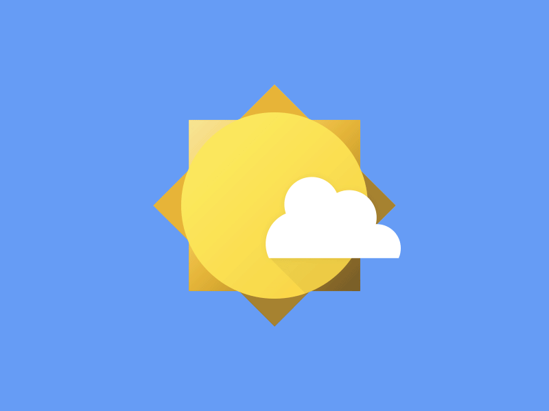
Google and Email
![]()
Back in 2004, April 1st in fact, Google Launched Gmail and techies everywhere started scrambling to get an invite code, myself included. Hotmail and Yahoo! Mail had been around for a while already, but Google was the hot and hip software developer that seemed to be able to bring some forward thinking to their design, and Gmail was looking to be the next exciting release to follow suit. Gmail launched with an inviting and easy to use UI, a revolutionary UX thanks to its pioneering use of AJAX to allow for live page updates, and 1GB of storage, which eclipsed other services and their pitiful ~2-25MB.
One of Gmail’s key victories was its ability to tackle spam using content analysis across its servers to help predict which emails looked like spam, and what users flagged as spam. This lead to our inboxes looking a lot cleaner and nicer to use. Ten years on Gmail had increased its feature set and updated its design, and whilst it was still a good piece of software it was getting older and the world was changing. So Google decided to ask a question.
What if email was invented in 2014?
With a clean slate, Google looked at the landscape of the tech world, which was much different to the one that Gmail launched in, and barely the same planet of that when email first appeared. A number of key observations were made.
- email was consumed across a multitude of platforms, even the same account.
- email served people with more than just message correspondence
- People received a lot of emails and it was causing a notable negative effect their day.
With an idea on which challenges to solve, Google set about building Inbox, an entirely new email client from the ground-up for Web, iOS and Android.
Material Design
To solve the issue of people moving between platforms and platform types to check their email, Google had a nice solution cooking elsewhere in its halls.
![]()
Material Design, an open source UI framework that was also asking questions about how things should look and act in the modern era. Built with a cross-platform vision, each Material feature considers how it responds to the different type of interface, from a mouse click to a touch swipe. The layout philosophy takes into consideration the various screen sizes and ratios we use helping designers build out applications. Applications are created with the idea that each element exists on a spatial like layer that helps a user mentally map out the structure of an application to improve the experience of navigation.
So, to build this new look email, Google chose to create it with a Material Design, which gave it a clean, intuitive look, especially as more applications and websites began to adopt the Material Design rule set (open source remember!), which would help users hop from app-to-app no matter the developer and feel at home.
Great UX
So there’s a great looking email application now, but what about the experience of using email itself and tackling that daily sack of messages piling up?
Google looked at what emails were about in the modern era and what we use them for, and it turns out we use them in a lot of different ways; including oddities like using draft emails as reminders and to-do lists. These observations helped create a number of features that became key to the Inbox experience. I won’t cover everything that Inbox does (or did), but here’s a few.
Conversations
Grouping emails had been around for a while but Inbox really built upon the idea that emails sent back and forth between people were like conversations, so it would group these emails as a single entry point, and when a new email in that group arrived it would show it all for quick access to the history of that conversation. It was more about the execution of this idea than the invention of it, email chains in Inbox really felt that way as it was built into the core of the design rather than added as an afterthought.
Subscriptions
When we sign up to a website they often ask for our email address, then they send an email requesting that we confirm. One nice feature is that Inbox could analyse and notice this, then elevate the confirmation link to the email preview, creating a great time-saving UX by forgoing the need to open the email and seek out the link first. It’s nice to see that this feature has been ported to Gmail.
Trips
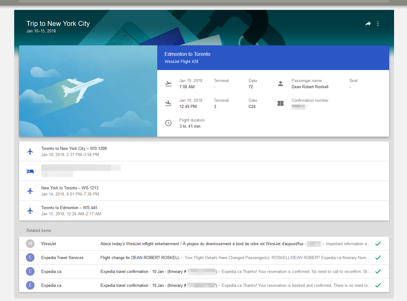
Emails about booking confirmations and tickets are often something we get months in advance of a trip, so we’d often find ourselves searching through email archives to locate the right ticket information when it came time to leave. Google brought all the different emails together and wrapped them into a single group Trip, which would present an itinerary, adding any future updates such as flight schedule changes automatically. It would also push the trip to the inbox prior to the trip date.
Reminders
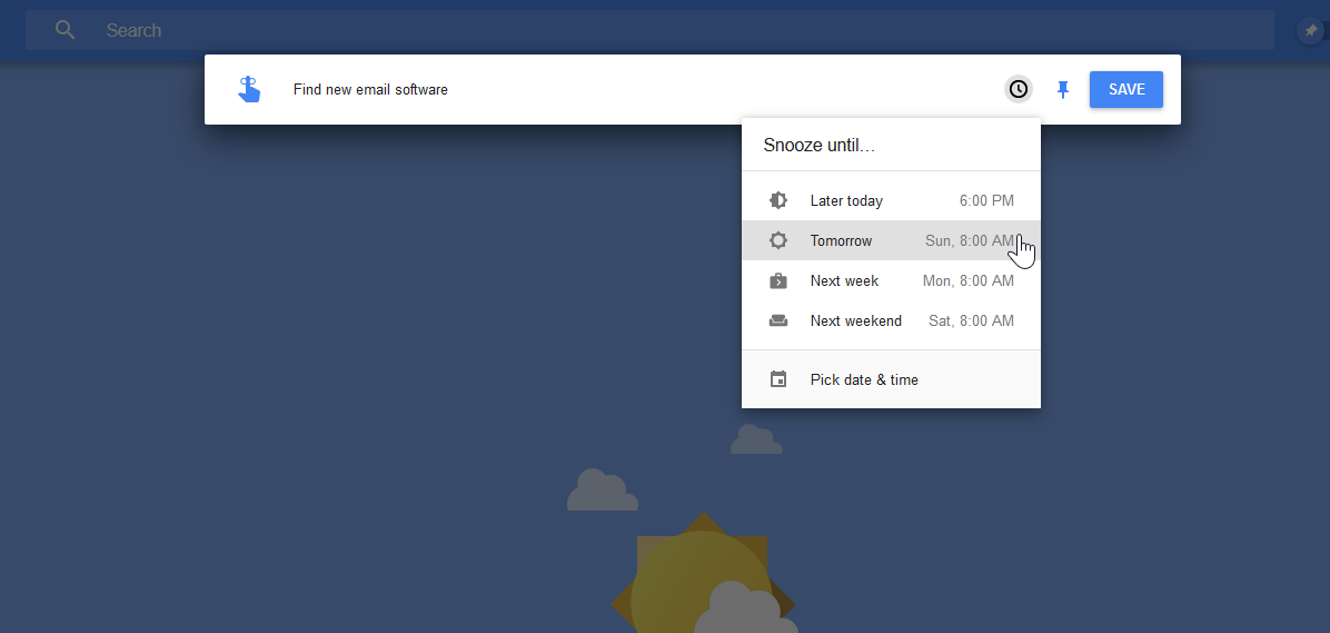
Rather than create a mess of a draft folder, Google added a feature right next to the Create Email button that allowed you to quickly add a reminder and set the time or date to be reminded of.
Terminology
Out of all of its features and presentation, there was one key concept Google applied to Inbox that made it a real game changer.
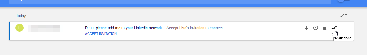
It changed the user’s approach to email by changing the language of interaction.
Traditionally emails arrived into the inbox and would be presented to the user as Unread, until opened, then they’d be changed to Read, sometimes along with this vague concept of Archive. –what does that mean? Can I still access it? Maybe I’ll keep it around in case I need it.
Google changed this core concept of: Unread > Read in to Task > Done giving email a sense of finality.
This encouraged the user to take action with an email as it was now a task.
Perhaps sending a quick reply now is a good idea rather than wait till later, because that then becomes a done task. Maybe you’re not ready to deal with the email just yet, so use the snooze function and delay the task for a day, a week, perhaps a month. What if the email simply isn’t important? Then just mark the task as done without even bothering to open it, hey it’s still a finished task!
![]()
This approach really helped users work through emails and rid their world of that dreaded home screen badge of doom that plagues our mobile devices.
A Celebration
There was one final seemingly silly addition to this, but as someone who develops games I can tell you that there’s nothing silly about it. Once the last email task is complete and the inbox clear, the user is presented with a reward animation/image. This is no different from the types of tricks used in video games, such as when a high score is exhibited, or a player finishes a level. We create fanfare, we celebrate the moment, and we share in the victory of the achievement. Another place to see this is in sports, we allow athletes time after scoring to perform a celebration dance, to cheer with the fans. It provides us with confirmation of doing well and a dopamine hit that chemically charges us. So why not celebrate ridding the inbox of that final email, that’s as good as scoring the winning goal right? It sure feels it.
What next?
It’s really sad to see Inbox come to a close. Google announced in late 2018 that they were shutting the service down, and since then I feel like I should have been looking for a new home for my email, but in that time I’ve not. Instead, I’ve been enjoying using Inbox just as I have for the past four years. I did try going back to Gmail but it’s missing the language of Inbox, I don’t want to be reading and archiving emails, I want to be celebrating the completion of tasks and being able to move on to spend the rest of my day being productive on other things.
This post is my farewell to a great service and my push to go and find a new home. First stop I’ll be looking at is Spark, it’s not yet available as a Web App or on Windows, but they say it’s coming soon. Maybe that’ll be the one, maybe not, we’ll see.
Psst, wanna keep up to date on my articles?