Selecting Pixels in Sparkshot
Our Web App Sparkshot.io is all about grabbing pixels to reveal the hidden art, but we don’t just want to create a functional application, we want to build something fun and engaging.
So how did we make the act of selecting pixels on a grid interesting?
Our Goal
Our goal is to make the UX fun and responsive but not at the cost of functionality. Sparkshot has the utility of allowing artists to fund their work by selling pixels, but on the flip side to that, can the act mere act of interacting with pixels be a fun and engaging experience in their own right?
Sparkshot gives users the freedom to choose the number of pixels and where on the canvas to select them, we want to encourage the user to experiment and respond to them through small feedback loops to react to what they do, and wherever we can provide an informative response to reinforce the process.
The Journey
In this article I walk through each of the major iteration of the feature, showing what it looked like at the time and describing our thoughts on the development process.
Humble Beginnings
When our team spots an issue or comes up with an idea, we talk it through, sleep on it for a while, talk about it some more and if we decide it’s good we will either shelf it until the time is right, or get writing some code to see if our assumptions were correct.
Sparkshot as an application is centred around this concept of selecting pixels, so we needed to jump on this feature right at the start and get something functioning that we could build around.
We fired up our tools: Atom to write the HTML and Javascript, a web browser to test, and started building.
The prototype achieved our goal of being able to select pixels on a HTML canvas, sure it was far from fun and pretty clunky, but it was something we could start building around. Once it was up and running we could start to work on other features and push towards building out the full application loop of being able to select, buy and reveal the hidden art.
Early Indications
Once we’d added more surrounding features to the core loop of the application it rewarded us with the time to go back for a second iteration on the pixel selection feature, polishing up the accuracy of the selection as well as adding in a new UI highlighter that tracked the mouse movement and informed the user of exactly which pixel they’d be selected if they clicked.
This was an important UX step as we didn’t want the user to have any uncertainty about which pixel they were about to select when clicking. Also Sparkshot allows the user to zoom in-and-out of the art, which means that pixel selection isn’t always up close and easy to judge.
The UI highlighter was the first step in helping select pixels at greater zoom levels and something we’d spend more time improving in future updates.
More Data
One of the features we have for artists on Sparkshot is that they can set the price for each pixel, which is useful information for the user to know so that they can be clear on what they need to pay.
Just like with the UI highlighter feature, we wanted to give this information before selecting a pixel. So with this update, we added a new price UI element that appears when the user hovers the cursor over a pixel.
Another major part of this update was to improve the visuals of selected pixels, which previously just filled the entire cell with a single colour making it hard to differentiate each selected pixel from its neighbour.
The way that Sparkshot renders the image isn’t always at a 1-to-1 pixel ratio because we allow the user to zoom in-and-out of the image. So when zoomed in close a single selectable pixel is, in reality, a square of many pixels, this gives us the freedom to add detail into that space.
With this update, we shrank the selected pixel icon leaving a clear border around it to help differentiate it from its neighbours. We also added a two-tone effect to the green to add a little style, admittedly only a little though.
Now things were starting to take shape, the UX was becoming stronger and the application easier to use even when zoomed out of the image.
Style and Motion
At this point many of the core parts of the application were functioning we were able to get a good feeling of the overall experience. This more complete picture gave us the idea of the amount of time users spent selecting pixels and the pace of the interaction, allowing us to see where we could add some of that playful UX.
Sparkshot at its core is about pixels, it’s true that the endpoint of the journey is to see an artist’s work in all its glory, but to get to that point we have to loop through the act of selecting and revealing pixels many over.
Being mindful of the final state where art is displayed on the screen, we don’t want to conflict with what draws the eye: the art must win! So we designed Sparkshot’s colour palette to be neutral so it sits back against the pop of the art. There is one area where we knew that we weren’t going to compete with the artist, which is on the empty pixels, in fact here we want the application to pop to help users track their selected pixels within the multitude of colours from the art itself.
To help reinforce the theme of the pixel we took the green selection icon and changed it into a more stylish pixel gem sprite, evoking the nature of the application and using a gem concept to represent the idea of value.
Gems are something which has become a sort of meme for value in the digital entertainment world thanks to its connected roots in video games where it’s been common for games to use fantastical currencies such as gold, gems, rings and such. In the more modern era of microtransactions, we see many games have their currencies based on ideas like gems.
To further differentiate between the selected pixels and the static art pixels we also added in some animation to the loop, pushing the UX more into that playful state of taking the act of selecting pixels from functional to fun with an animated response to user input.
Many Pixels all at once
This update was interesting as it was something we’d talked about for a while but resisted adding without going through some careful consideration. The feature in question was to allow users to speed up the act of selecting more than one pixel, often requested as some sort of fill tool, or box select, and up until this point users needed to click on each pixel individually to select or deselect them.
We had just entered an early alpha stage and begun to invite users to come on board and test the application out live, and we expected and certainly heard the requests come in to allow a quicker way to select many pixels quickly.
As I said we expected this, so why hadn’t we already added the feature?
Well, it was a philosophical thing really, when we set out to build this application we talked about trying to create the smallest meaningful transaction loop possible, which in our case was a single pixel.
Our goal was to build around this concept and see if we could achieve it or at least see how close we could get. We pushed to make selecting a pixel a fun experience, with the grand idea of seeing it as part of a multi-user space where each individual user might only make a small contribution, but everyone achieves the final output, and in Sparkshot’s case that’s individual pixels leading to a complete piece of art.
We felt that if we added multi-select early on then we would focus on creating an application where users were expected to select many pixels to get achieve any fun, and while this ultimately might be true on some level, we wanted to push our idea as much as possible before we opened the pixel selection flood gates.
Another reason for resisting this feature is based around the art uploaded by artists, which represents the other side of Sparkshot. The act of selecting and revealing pixels needs to be fun, but it needs to lead to great art, and what is good art on Sparkshot? We’re on the journey to finding the answer to that.
Before I derail this with a topic that requires a full article of its own, I can cover a few points that concern this feature.
One reason why users might feel that they want to select a lot of pixels is that there’s a lot of pixels to select, meaning the artist has uploaded a large piece of art. Sparkshot supports up to 1000x1000 resolution images, which consist of 1,000,000 pixels. That’s a lot of clicks. So perhaps there’s a solution in finding good art at smaller resolutions, requiring fewer clicks and less of a feeling to need to select a lot of pixels gain a reward. We don’t want to make any clear claims as of yet, but we do want to support Sparkshot through a stage where we let artists and users seek some form of balance between their needs and we’ll happily support what works for both.
Anyway, back to this update. After working through to UX to this point and being satisfied with the feel and function, we added the ability to drag-select and drag-delete pixels which required some rework of the controls, which as of now are:
- Left Click - Select/Deselect
- Left Click & Hold + Drag - Multi-Select/Deselect
- Mouse Wheel - Zoom
- Right Click & Hold + Drag - Move camera
We also updated the gem sprite with a new 3D rotation animation to help increase the motion and response of the interactions. The new animation felt good on the single click select, but we also found that when drag selecting multiple pixels it created a fun ripple motion effect which felt encouraging, adding an extra layer to the feedback loop.
Overall we hope that our resistance to add this feature helped result in seeing the act of adding more pixels is done by the user for the extra reward and not just to achieve a base sense of engagement with Sparkshot.
A Dead End
With the controls getting more complex thanks to the added drag-select function we decided to update the UI to let the user know which mode they were in by changing the UI highlighter with an icon to display the current mode.
This update turned out to be a very short-lived version as we quickly realized that zooming out of the art renders the UI highlighter unreadable, so instead, we needed to show it on an element that wasn’t affected by the zoom level.
I wanted to show this update to help highlight that it’s good to test ideas and remove what doesn’t work. Removing a week’s worth of work is nothing when you consider the many hours’ users might collectively put into the application. So test assumptions and don’t be afraid to kill them if they don’t work out, you still learn a good lesson to take with you even if there’s nothing to show for that time.
Polish till it shines
In this update, we focused on polishing our feature set. Taking the time to improve on the systems, the visuals and taking things to the next level.
First, we scrapped the last update of adding the mode to the UI highlighter and instead put it in the much more sensible location of the mouse cursor, which does not suffer from scaling with zoom so it’s readable no matter what’s happening on screen.
What we did add to the UI highlighter was contextual colour based on the current select mode, which compliments the change to the mouse cursor.
We reworked the gem sprite from scratch adding more frames of animation, more pixel detail and lighting to help it pop on the screen.
Finally, there’s a new UI element to round off the feedback, which confirms to the user of the price adjustment based on the selected or deselected pixels. An animated text element floats upward after the user completes an interaction loop (releases the mouse button), which can be a one or more pixels sequence.
Here’s a sequence that shows off the delete action, using both a red icon and red UI highlighter to clearly confirm that the action is removing pixels.
A pixel delete animation was added too for extra polish and to hopefully make removing pixels as fun as adding them.
A final piece of flair was added to the interaction loop. Given that we had all the frames of animation to rotate the gem sprite, it felt like having them react to the cursor passing over would be both a fun thing to interact with as well as suggest to the user that selected pixels can be further interacted with. So the UX there works to suggest to the user that there’s more based on very low friction input.
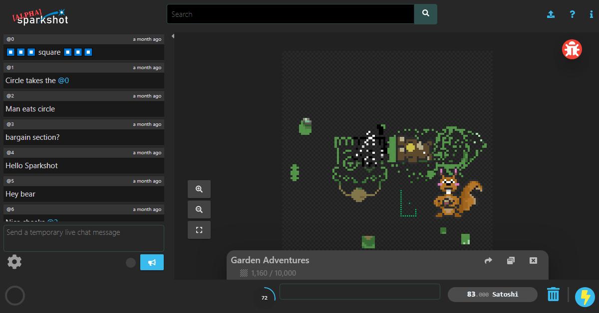
Finally, just to prove what I said earlier, even when zoomed out of the art selecting pixels is clear and as easy as it is zoomed in, sure you don’t get the nice detailed animation (maybe we’ll find a way to fix that up in the future), but you can see the current mode, and know what pixel you’re going to select next.
Conclusion
This brings us to where Sparkshot currently stands. This feature will continue to be a big focus as the application continues to grow, in fact I held off writing this for a while as I kept wanted to get another iteration complete before I felt it was ready to talk about, but I guess the length of this proves I was wrong there.
We’re going to bring more articles about other areas of the application in the near future, so keep an eye out for when they get posted.
If you’d like to try Sparkshot for yourself as an artist a user or both then please join our Telegram group or checkout our website Sparkshot.io, we look forward to seeing you there.
Psst, wanna keep up to date on my articles?